
portfolio

Illustrations made with acrylic paint and images (printed or from magazines). I decided to focus my project on the issue of plastic since I’m really passionate about it and try to decrease the amount of plastic I use every day. I chose to use the letters cut out of the newspaper since I wanted to mimic the ransom note. I wanted to make it seem like the sender of the note was the ocean that, by being constantly filled with more and more trash, wanted people to realise the issue and take action.

I enjoy working on illustrations for editorials since there are many aspects that need to be taken into consideration like making the images flow with the text. It was my first time creating for an editorial so it made me learn things that I could then use to improve my future editorial illustrations. I also wanted the images to have something in common like an image in order to tie them together. I decided that the identical images of bottles and cotton swabs would show that in a very good way.

For my projects I always create maps of artists whose work is either inspiring to me or who are focusing on a similar technique. Here, I focus on artists that create art concerning the plastic issue or are in college or editorial illustration. I always print the images and put them in my sketchbooks but in order to show the images in higher resolution, I decided to make this slide.

I decided to start my project on the issue with plastic by exploring plastics themselves. I collected various containers in interesting shapes and began to quickly sketch them out. I tried layering them, drawing with one continuous line, using toothpicks or small branches dipped in ink. I think experimentation is an important part of the development because it allows me to explore the subject in a free way and get more comfortable with it.

My planning process for the illustrations was to plan in which direction I want to go, which colours to use etc. Here, I experimented with various colours, ways of layering paints and collage methods in order to find the best one for my project.
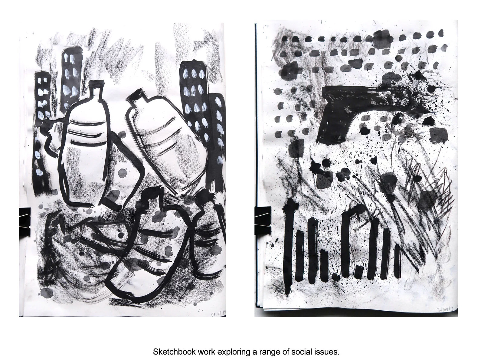
In order to decide on which social issue I would like to focus my ‘Social’ project, I started doing very quick sketches just over the duration of the videos that concerned those problems. I did them in my A3 sketchbook with a range of black or white materials like ink, conte, graphite sticks, oil pastels, acrylic paint. The attached sketches were from videos concerning plastic issues and gun laws in the USA.

In development stages for the CD cover project, I tried many progress-based techniques like Barbara Nicholls’ watercolour method or Jak Box’s water and graphite powder pouring method. However, the Japanese Kintsugi technique was what really inspired the whole concept of my album design. Apart from the brown vase I additionally used a white plate which added contrast to the whole piece. I used hot glue and gold paint to fill the cracks. Unfortunately, the texture of the glue really came through the gold paint so I smoothed it out digitally to make it look neater.

The album I was designing the CD cover for was called “Progress” and I really wanted to show that in the final design. The circle in the front and back as well as the pictures of the vases on the side segments show the vase before and after it was deconstructed and reconstructed. I focused on making the colours, shapes and fonts fit well with the tone and style of the singer and his album.

I started my planning process by researching interesting album designs which helped me decide in which direction to work further. Then I took pictures of an album that had the same structure as the cover I planned to design. Then I planned each of the 6 segments.

My final illustrations for an article. I quite enjoy working digitally since it gives a clean look to my work. I drew inspiration from the adjectives used in the article. This was my third time making illustrations for this project as I wasn’t completely satisfied with the previous ones. This gave me the opportunity to see what works and what doesn’t. It allowed me to use that knowledge and create something that I was happy with.

The planning stages and the previous 2 projects allowed me to improve my design. I also did additional research which enabled me to find the right colours and develop the character in the final illustration.

Polaroids give me the ability to experiment with photography and create something unconventional. There is always a bit of a mystery how the image will develop which makes the process hard and tedious but at the same time very satisfying if we get things right. I particularly like to work with double exposure and slow shutter speed. Photos were taken with an Instax SQ6.

Very quick sketches made in my A3 sketchbook with conte. The one on the right is a self-portrait made by just touching my face and sketching what I feel.

This video in 3 short clips shows the issues concerning overuse of phones and the internet. I wanted to express my feelings of how living more online than in real life influences our lives and relationships with others but also ourselves. I think I managed to show how things really are in a raw way since I know these issues really well from my personal life.
Video is about 2 minutes.

At the beginning of the environmental project I started by visiting interesting places in my city and doing quick sketches of them.I then made collages with photos I took in these places. This exercise allowed me to look at buildings and shapes of them in an unconventional way.

A sequence project in more children’s book illustration style. I wanted the images to be vibrant and simple. I really enjoy working with watercolours as it is my favourite medium. I definitely want to develop the story more since I believe it has potential.
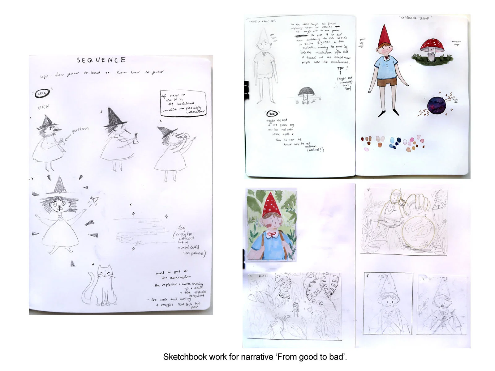
Development of the story for the sequence narrative project. For every project, I always think of a few ideas first and then settle with my favourite one. Throughout this project, I realised that making sequences is very time consuming since it requires a lot of planning. But the satisfaction after it’s finished makes up for the whole struggle.

Experimentation with the background using salt and ink and exploring monoprinting. I wanted to show anger, disgust and generally strong emotions in the faces of the characters.

My own narrative focusing on the issues connected with TV influence, inspired by Kristian Jones. I have a lot of personal feelings connected with this issue. Creating the illustration for it was especially challenging as it required me to work in many techniques and on a quite large format - B2. The faces and TV were made with monoprint. The background was blue and black ink layered and the red “radiation” was a red foil which was difficult to work with but the effect it gave was definitely worth it.

Artists that inspired my Society project, focusing on media, internet and the emotions connected with it.